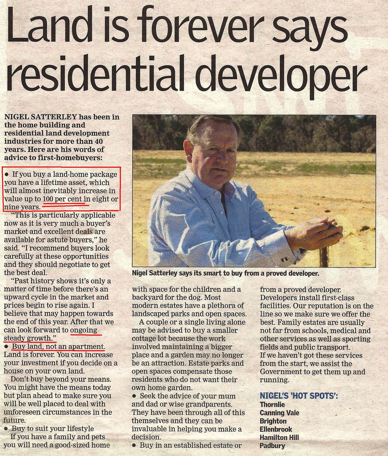
Australia's Housing Oversupply
Below extract from Money Morning Site showing the "MYTH" of under supply in the Australian housing market. Stick with the article & it falls into place.
Money Morning reader Paul sent us an interesting document late on Friday.
It was from the Institute of Actuaries of Australia.
Before you fall asleep, stay with me… it’s worth it.
The document is titled,
A house or a home? Finding value in Australian residential property.
You can download the document, accompanying presentation and audio by clicking
here and searching for the author’s name, Anthony Street.
In part of his presentation, Mr. Street picks up on the numbers the Commonwealth Bank of Australia used in its presentation to international investors last year.
Revealing the real numbers
You may recall, your editor was the first in Australia to pick up on CBA’s neat little trick. We printed these two charts in
this article. First the one the CBA used in its presentation:
At the time we smelt a rat. Note the sources the CBA used – Demographia and UBS. At first glance you notice the house price to income ratios for Australia are on a par with other cities overseas – except Vancouver. More on Canada later.
But having actually read the Demographia report, we sensed something was up. Turns out the CBA used Demographia numbers for all other cities, but UBS numbers for Australian cities. This is second chart we printed showing how the numbers would look if Demographia data was used for all cities:
Spot the difference?
You’re looking at a nearly 50% increase in the ratio. No wonder the banks don’t want you to see that.
But Mr. Street went one step further. He actually called the CBA and asked them if it was fair to use two difference sources, especially when the methodology for the data was different.
Here’s Mr. Street’s take on the conversation:
“I did get put in touch with the author of the report and… he admitted that he calculated the Australian numbers… using the Australian accounts information and calculated… using an average income number for the denominator and so… I did sort of question well, do you think calculating… the Australian number using average income and comparing it to other countries that have a median income that maybe it’s not a… like-for-like measure?
[Laughing by actuaries in audience]
“And his response was, well, you’re an actuary so you understand that kind of stuff, but none of the clients I took it to noticed anything!”
[More laughter].
But that wasn’t the main thing that stood out. Mainly because we already knew about the CBA’s neat trick. What pricked our ears was his analysis of a chart we had seen many times before.
Such as this one used in an ANZ report last year:

Source: ANZThis is one of the spruikers favourite charts. They use it to “prove” an undersupply in housing. They point out supply and demand were closely tied until around 2006 when demand shot higher and supply ground to a halt.
Massive undersupply?
But tell me something. What do you notice about the chart?
The clue is in the headline of today’s
Money Morning.
That’s right, the scale.
Mr. Street produces two charts of his own. First, one that’s similar to the ANZ chart:

Source: Mr. Anthony StreetIt shows the same thing. Supply and demand almost locked in step, until 2006 when population growth took off and annual dwelling starts stopped.
But here’s where it gets interesting. Mr. Street reproduces the same data, but changes the scale. Here’s what he comes up with:

Source: Mr. Anthony StreetWhy is the change in scale important? What Mr. Street did is move the scale of the annual population growth to be 2.5 times the number of dwelling starts. For example, 200,000 on the right hand scale is 2.5 times greater than 80,000 on the left hand scale.
Chronic oversupply
This number represents the approximate number of people per dwelling.
In other words, if the average household size is 2.5 people, then you arguably need one dwelling per 2.5 people.
So, if the population increases by 200,000 you could expect to need 80,000 dwellings.
As this chart shows, for most of the 1980s, 1990s and early 2000s the ratio was closer to one new dwelling per 1.5 people. Or to put it another way –
an oversupply of housing.
In fact, a
chronic oversupply of housing.
Most likely as a result of negative gearing rules that encouraged investors to build housing at a loss. So what this chart shows is far from there being a chronic undersupply of housing, there has been a chronic oversupply of housing for all but the last two years!
It’s amazing what a change to the scale can do to perceptions isn’t it?
But let’s get back to house price to income ratios. We’ll admit, this is a difficult one to accurately measure.
There are all sorts of numbers put about by spruikers and non-spruikers. The spruikers claim the price to income ratio is only 4—4.5 times. Whereas Demographia claims it’s as high as nine times in some cases.
Big-time US investor Jeremy Grantham reckons the Australian house price to income ratio is about seven times.
Who do you believe?
Australian housing IS expensive
We had a bash at it ourselves in 2009. Based on our estimates, the house price to income ratio was about six times… but even then we thought we were being conservative.
But, given we’re due to take part in a property bubble debate on 7th June
[click here to sign up], we thought we’d have another crack at comparing house prices to incomes.
Again, we’re not saying it’s a fool-proof comparison, but we’ll throw it out to you and you can send feedback to
moneymorning@moneymorning.com.au to let us know if we’re on the money or off the mark.
We reckon we’re on the money.
We’ll publish the responses – if we get any – later in the week.
Here’s what we’ve come up with. In the table below you’ll see a comparison of estimated housing values for Australia, United States, UK, Ireland and Canada.
Next is the estimated GDP for each nation. We’ve chosen GDP because it supposedly measures the total income produced each year for an economy. Again, it’s not a perfect measure, but at least it’s a consistent measure of income across all four economies.
Then in the final column you’ll see the ratio of house prices over income:
| Country | Housing Stock | GDP | Ratio |
| Australia 2011 | $3.5 trillion | $1 trillion | 3.5:1 |
| USA 2007 | $22 trillion | $14.1 trillion | 1.5:1 |
| USA 2011 | $16.4 trillion | $14 trillion | 1.2:1 |
| UK 2009 | £4 trillion | £1.3 trillion | 3:1 |
| Ireland 2007 | €520 billion | €172 billion | 3:1 |
| Ireland 2009 | €400 billion | €151 billion | 2.6:1 |
| Canada 2011 | $4.5 trillion | $1.28 trillion | 3.5:1 |
For the Australian housing stock value, we’re being conservative. $3.5 trillion was a number bandied around two years ago, so by the peak late last year it was probably even higher.
But any way you slice and dice it, compared to countries where property prices have crashed – US, UK and Ireland – Australia’s housing is expensive… by a fair way.
And even near the peak of the US housing bubble, the ratio didn’t exceed 1.5 times GDP.
Now, that’s not to say Australia’s will fall to 1.2:1 like in the US, but a similar percentage drop would see the ratio slip from 3.5:1 to 2.8:1. Trust me, that’s a big drop, and in percentage terms it’s similar to the drop seen in Ireland.
Considering Jeremy Grantham reckons the UK housing market is still in a bubble, that number is set to get worse too.
The only country in the above table with a similar housing stock to GDP ratio is Canada, also around 3.5:1.
That shouldn’t come as any surprise. In fact, in a way it confirms this method of measurement could be accurate, as many have claimed the Australian and Canadian housing markets are similar…
Similar in that that both display signs of being in a housing bubble.
Anyway, as we see it, it’s more proof and evidence for our bearish view on housing. As we get closer to the debate in Sydney in June we’ll give you more insights into the content of our presentation – a presentation that’s likely to have the bulls ducking for cover!